Artificial Intelligence

Tangible and Embodied Interaction (2019) – Week 4

In the previous course we came into contact with artificial intelligence and although I find it very interesting, I did not enjoy the topic that much in the end because it was rather complex. This week, however, we will play with input and output through Processing. I already have some experience with processing from previous years and it gave me a lot of pleasure. According to Daniel, we will work with generating sounds, of which I am a big fan. I play around with Fruity Loops, a digital audio workstation, quite often and I am curious to see how we can generate sounds through machine learning.

Introduction & Literature (2nd of December)

The purpose of this week was to explore AI technologies through tinkering and discussion. We were to work with Wekinator, a machine learning software that allows one to build creative systems such as musical instruments. Input and output could be created through the use of for example Processing and Arduino. I was pleased that this week was central to exploring and learning from failure, because it allowed me to take risks.

The lecture kind of repeated our insights on machine learning from the previous course. A downfall of computers is that it cannot interpret the context of a situation like we humans do. By giving a computer experiential, it can learn to understand fuzzy logic, like for example recognizing a face based on certain data. In the previous course we created input through an accelerometer and gyroscope based on movement interaction. We trained the machine to recognize movements, but did not really experiment with the output. This course, however, was intended to train the machine on both input and output.

Compared to the previous three weeks, I found the literature to be very complex and less interesting. I was keen to get started experimenting. What I find very interesting in the article “Sensori Motor Learning with Movement Sonification: Perspectives from Recent Interdisciplinary Studies (Bevilacqua et al., 2016) ” was the combination of movement-oriented and sound-oriented tasks. The authors conducted an experiment in which sounds were used to specify a movement (i.e., performing a movement while being guided by sound feedback).
I think it would be interesting to use this combination in sports such as football. For example, I can imagine that the training of passing a ball with a certain speed can be improved by means of sound.
In addition, I see potential in the use of sound feedback when performing dance movements. For example, sound can not only be used to perform dance movements, but dance movements can also provide sound feedback, which reverses the complete concept. The authors did however mention that it is likely that people exhibit different audio-motor abilities, which could become problematic in sports where preciseness is key.

The second article “Kontrol: Hand Gesture Recognition for Music and Dance Interaction (Christopher et al., 2013)” was a little more inspirational to me. In fact, it was ultimately the inspiration for one of the experiments that follows later. According to the authors, hand gestures are an important part of our communication; Hand gestures can strengthen our speech and represent our emotions, also while playing a musical instrument. By using their tool (i.e., Kontrol) as an extension of one’s arm, they were able to use this form of communication as an input for an electronic output. This gave me the idea of using hand gestures for playing ‘air’ instruments, completely separate from a musical instrument. A bit like conducting a choir, but instead playing an instrument ourselves. I saw it as a tool with which we could make the air guitar a real instrument.

jimmy fallon air guitar GIF by The Tonight Show Starring Jimmy Fallon
The well-known air guitar.

The last article that I read “Sansa: A Modified Sansula for Extended Compositional Techniques Using Machine Learning (Macionis et al., 2018) actually build a little on the inspiration I gathered from the previous article. The authors extended an acoustic instrument to enhance it’s possibilities and enable a musician to have more complex interactions with different media. I think this concept can be used to improve an acoustic instrument for electronic music related purposes, where one instrument can be used as an input for many different outputs.
The downfall of this, in contrast with the Kontrol tool from the previous article, is that the technology must be attached to the instrument which causes disruptions in the way the instrument is usually played. Due to the many challenges that the authors had formulated at the end, I am not yet convinced that this is a useful tool.

List of notes about the topic

  • The combination of movement-oriented and sound-oriented tasks can be valuable while thinking in terms of machine learning.
  • By using tools as an extension of the human body or an instrument, we are able to have an more complex interactions through multiple types of media.

Exploration & Experimentation (3rd of December)

The Tuesday lecture was meant to introduce and experiment with AI and to setup the Wekinator software. After playing with some of the Google AI experiments, I concluded that one of the ideas that came forth while reading the articles has already been implemented in short, but rather specific. The Semi-Conductor enables one to conduct an orchestra through hand gestures, with the use of computer vision. The song that played was however predefined.

Unfortunately I forgot to record my own results from the Google AI experiments, thus decided to enhance this section through the provided YouTube videos that come with the experiments.

The Semi-Conductor experiment.

One other project that caught my attention was the Quick, Draw! experiment. I think it is very interesting to see how machine learning can guess images that are being drawn, based of off input from millions of people. It was actually very accurate in guessing my drawings and I am surprised by it’s capabilities. However, it was less in line with what I had in mind for this week.

Quick, Draw! experiment.

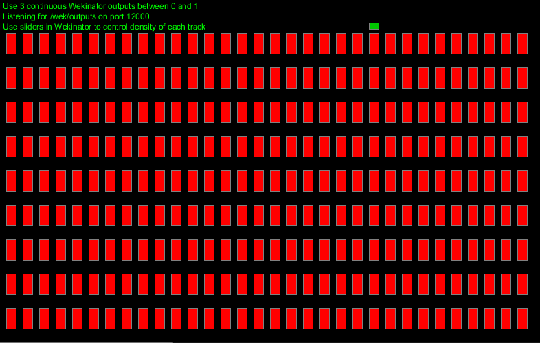
After playing around with different experiments we set-up the Wekinator software. I tinkered a bit with the different input and output examples and I started wondering if Fruity Loops could be used as an output source. After a little research I concluded that this may not have been the case, or at least not for this week. I started thinking, what kind of aspect of fruity loops would I like to recreate and use as a source of output? I immediately thought of using the Processing drum machine that came with the output example folder.

Drum machine output source containing three different samples to produce a beat with, based on a certain rhythm (beats per minute).
Each bar represents a beat and the output is constantly being looped.

The drum machine has some similarities with the Fruity Loops’s playlist and piano roll, in which different sounds or notes can be placed and triggered according to the beat. But what was going to be my source of input? As I mentioned before, the articles inspired me to make reality of air instruments. Daniel mentioned the leap motion controller during his lecture and luckily one of my teammates managed to get a hang of it. As a first experiment, I thought it would be very interesting to have various gestures triggering different samples, so that we could make our own beat (e.g. a drum pad).

While my teammates went to work on the leap motion controller, I focused on the drum machine. I created a number of sound samples, based on the song Still D.R.E by Dr. Dre, that we could use in our drum system. The song has a very simple and generic composition, thus I thought this would be an easy way for us to get started. For the drum machine I created a number of new rows with output. Although it took quite a lot of time because everything was hard-coded, I thought it was a fairly simple activity. If I had had more time this week I would have written a more variable code, which would allow for a bigger variety of samples.

The upgraded version of the drum machine output source, containing all the samples of the song to make a melody, a bassline and a beat.

After all of the sound samples were working correctly, we spend some time on making the connection between the Leap motion, Wekinator and the drum pad. Unfortunately, we were not able to train the machine according to our own input. I think this is a bug in the drum pad code, which only allows Wekinator to declare a randomized input. Even thought we were able to train the system and have it work with randomized beats (which sounded horribly), we were not happy with the result. We named it ‘The Drunken Dre’, as it was supposed to be sounding similar to his song, but most clearly did not.

‘ The Drunken Dre’, the first iteration of our idea which only allowed for randomized input.

As we had no clear solution in mind, we decided to Wizard of Oz the concept, in order to showcase the way we imagined training Wekinator for using our air drum pad. The hand gestures were not predefined, so they convey no meaning in the video below. The output of the drum pad did not change either, because it was obviously not linked to the input during the Wizard of Oz method. The idea however was to change the various chords by means of different gestures.

The Wizard of Oz result of our first prototype.

List of insights from experimenting

  • There are already some experiments available that relay on gestures as musical input.
  • The provided tools may discourage the ideas and coding for machine learning is rather complex. However, speculating without feeling limited by technologies can support in ideation and results can be generated through means of different prototyping methods.

Seminar (4th of December)

This week we had quite a different way of having a seminar then I had expected. Every individual had to deliver one or more question(s) about the literature. I thought of these question as a way to open up a discussion. Because there were two things that rather confused me from the articles, I wrote down the following:

  • What opportunities does Kontrol, in combination with Guqin, yield? I did not really understand the purpose of this, as they concluded absolutely nothing for this combination of tools.
  • What limitations could other instruments have when applying technology such as they did to Sansa? They only spoke about an instrument that is less commonly played then, for example, the piano or the guitar. I was wondering how the result would change if the authors had tried to implement the technologies into different instruments and was curious if people had thought of limitations for more commonly played instruments.

My questions were unfortunately not mentioned during the seminar and because of it’s rapid pace, I only got few important insights. Our group got the following question:

How can one differentiate between sound-oriented tasks and movement oriented tasks?

Our answer was straight forward: “You pay attention to different motor levels. The different amount of parameters to complete a specific task differentiate the two.” We couldn’t really find anything interesting to add to these answers cause they seemed rather obvious. Two other group had very similar questions which opened up some discussion. I concluded the following:

The combination of sound and movement seems very interesting whereas movements can be applied to trigger certain sounds or vice versa. This could for example be used in sports, whereas it is already used in dance, but not in many different sports. According to Daniel, it was about creating different ways of giving feedback. This is very similar to what I concluded from the article myself and thus it gave me little new insights.

One other interesting question that came forth during the seminar was: ” Why do we need to put more technology into art?“. Art can use technology as a critical reflection. Technologies have always been involved with some sort of art. I think technology in art makes the art more interesting in general. An argument to be made is that you cannot separate art and technology, as it is part of our nature to combine them.

List of seminar notes:

  • Differentiating between sound-and movement-oriented tasks is about creating different ways of giving feedback.
  • Art can use technology as a critical reflection, whereas we can argue if we can separate the two due to our nature of combining them.

Further Experimentation (4th of December)

Because we finished the drum pad idea rather quickly on Tuesday, and because Daniel needed some time to look into our problem that occurred when training the Wekinator, I started experimenting with the code to make my ‘air-piano’ reality. Firstly, I created piano samples of each note for 7 octaves in Fruity Loops. This was rather time consuming, but having the samples ready is always a good thing. Secondly, I created a new row in the drum pad for each of the notes. Lastly, I made sure we only had one beat to work with, instead of 32. The idea behind this was that I wanted each finger, when using Leap Motion controller, to trigger a different note.
The problem with this was that the drum machine is meant to loop a beat on a certain tempo and thus will always trigger the note once it has been activated. In addition, if Daniel was not able to fix the problem that occurred with the drum machine, we were not even going to be able to trigger the notes individually. A kind of frustrating failure, as I spend quite some time on coding.
I had to come up with a better solution and Daniel advised me to look into the FM synth example. In this example, a synthesizer changes the sound depending on the position of your mouse in the canvas. I created a similar experience where notes of one octave will be played depending on the position of your mouse (see video below).

Notes being triggered depending on the mouse position of one’s canvas.

The next step for further experimenting would be to connect this processing sketch to the Wekinator system while using the leap-motion as an input source. In addition, if Daniel manages to fix our problem that occurred with the Wekinator, we might be able to get the input for the drum pad working tomorrow.

Quick notes

  • Experimenting can be rather time consuming and it is best for me to think my idea through first and discuss it with the group.
  • Try to make the prototype work with fewer samples at first instead of creating the entire idea in one go. This creates better opportunities for debugging.

Concluding our experiment (5th of December)

According to Daniel, it is not possible to take full control of the output, as it is in this case generated by Wekinator. It is however possible to adjust the sliders in order to produce a specific beat. After playing around with the slider for a while, we concluded that we were to make a better sounding beat then ‘The Drunken Dre’, but we were unable to adjust the sliders to play the exact song we had in mind.

I didn’t like to leave it there, so I started thinking about ways to improve the code. After looking into it, I discovered that there were certain float values being send to the Wekinator in order to have communication between the in-and output. These values could be adjusted in order to create a specific beat, but there was no beginning given the amount of samples we had used and the amount of time we had left. We therefore decided to leave it as the less perfect beat and focus on reflecting in preparation of the presentation.

The final result of our experimentation with Wekinator.

I personally think Wekinator is a great tool for rapid prototyping through machine learning. It enables easy communication between different forms of interesting inputs (e.g. the leap motion controller, human computer vision) and outputs (e.g. sounds, text, drawings).
I think a downfall of Wekinator is that it is limited in its use due to the lack of user control in terms of output. For example, we wanted to train the model to a specific output that was generated through processing, but Wekinator only allowed its own input to be in control of the Processing drum sketch.
On the other hand, I feel like there was too little time to discover all the possibilities that Wekinator enfolds, thus my experience can differ from my peers. I do however think that this tool has more to offer than the tools we used in the previous course, because it allows for easy communication between multiple sketches, whereas the tools used in the previous course were very limited in what they could do within a limited amount of time.

I think we succeeded in making noise, although it was far from what I wanted it to be. Unfortunately, I had no time left to continue working on the air piano and I might play around with this in the near future, because this seems like something I am very interested in.

Concluding thoughts

  • Wekinator did not allow us to have full control of our output, thus I think we should have explored its possibilities in advance.
  • I think Wekinator is a great tool for rapid prototyping through machine learning, as it allows for easy communication between multiple sketches for both in and output.
  • There was too little time do discover all the possibilities that Wekinator enfolds.

Presentations (6th of December)

Other then the previous weeks, the round of presentations started with a demo session of each project. I quickly noticed that the other groups that had used the leap-motion controller had a sort of similar idea to what we had in mind. I personally thought Simon’s synthesizer sounded way better, because they used simple sound samples that were not linked to a specific song. As a result, the instrument sounded better when given random input, which made the experience more pleasant and not as disturbing as ours. This project was more in line with the way I had imagined the air piano would work out. They ran into the same problems that we had encountered, thus better exploration of Wekinator is necessary to get a hold of its strengths.

A number of different groups had made use of physical artifacts, which gave me the feeling that we have been slacking this week, even though we had put in a lot of work. I think the strength of having a physical artifact is the tangibility that was missing in our project. When playing with the leap motion, I was missing the magical feeling of changing sounds without touching anything. When for example, interacting with the plant from Julija’s group, I got that magical feeling for some reason. This confirms, as previously described in the literature, that a musician handles an instrument in a unique way. I think it is not just about the music, but also about playing (i.e. touching and feeling) the instrument. I am thus far not convinced that the air piano is a strong concept.

In terms of feedback on our presentation, Daniel mentioned that the mental model we had in mind was most likely different then the mental model of the creator of the tool. This could have been the reason why we ran into a wall. In further design practices, we should look at constraints as opportunities to figure out the full strength of a tool.

A final note for this week

  • Better exploration of Wekinator is necessary to get a hold of its strengths. It is good to compare one’s own mental model to the model of the creator of the tool. Exploring the limitations and opportunities that a tool entails can be beneficial in exploiting a tools strengths.

Literature

Bevilacqua, F., Boyer, E. O., Françoise, J., Houix, O., Susini, P., Roby-Brami, A., & Hanneton, S. (2016). Sensori-Motor Learning with Movement Sonification: Perspectives from Recent Interdisciplinary Studies. Frontiers in Neuroscience10. https://doi.org/10.3389/fnins.2016.00385

Christopher, K.R., He, J., Kapur, R., & Kapur, A. (2013). Kontrol: Hand Gesture Recognition for Music and Dance Interaction. NIME.

Macionis, M.J., & Kapur, A. (2018). Sansa: A Modified Sansula for Extended Compositional Techniques Using Machine Learning. NIME.

Data physicalization

Tangible and Embodied Interaction (2019) – Week 3

I see a lot of opportunities for my future in data visualization, especially since I think that nowadays almost everything revolves around data and information. The part that interests me the most is the way we can make very complex data easily understandable, meaningful and aesthetically pleasing. It is an interesting and challenging topic to me and I am curious to explore what data physicalization can add to the representation of data.

Introduction lecture & group discussion (25th of November)

To amplify my thoughts and summarize the lecture: the goal of data visualization was described in the lecture as: ” the use of computer supported, interactive, visual representations of abstract data to amplify cognition (thought).”, Which in my own words means, making it easier to understand information (i.e. data). Data visualizations are usually presented through easily interpretable representations on mediums such as a computer display or a paper info graphic. Data physicalization opens up the opportunity to present information (i.e. data) in a tangible way (through physical objects and materials that we can manipulate and interact with)
Dynamic physicalizations are usually distinguished from static physicalizations by their ability to move, be variable and meaningful. Static physicalizations are, for example, 3D-printed object as they can not be updated or update themselves. We can use data physicalization in, for example, analytics, branding, communication & art sculptures.
We can use data physicalizations to inform (e.g. present facts, change opinions) or to provoke (e.g. a particular reaction or emotion).

During the lecture, we were presented with few examples of data physicalizations. I am quite critical about some examples, and I am quite positive about others. For example, I think the use of LEGO blocks is a very childish way to present data. Having LEGO blocks added little value to the representation of data and it could have been more aesthetically pleasing and meaningful if it was a visualized by means of a digital display or infographic.
On the other hand, the representation of rainfall in Europe, through the use of growing moss (i.e. living organism), is provoking to me in a way that it made me think about climate change and deforestation, which I think would not have been the case if it was presented through the use of a regular data visualization. The combination of being informative and provoking made the presentation more meaningful.

Our assignment was to come up with a concept for a data physicalization that is both provocative and informative. I think Maliheh’s example of the breathing lungs that represent the air pollution in Amsterdam, along with the accompanying sketches and the FBS-model (function, behavior, structure) are a very valuable source of inspiration for designing an installation (i.e. physicalization). The use of this model seems to enhance communication about the concept and thus improve the design process.

List of keynotes from the lecture:

  • Data visualizations, thus physicalizations, are used to make information (i.e. data) easier to understand.
  • Data physicalizations open up the opportunity to present information (i.e. data) in a tangible way (through physical objects and materials that we can manipulate and interact with).
  • They can be used to inform and provoke, which adds more meaning to data, which I think would otherwise not be possible through digital visualizations.
  • The FBS-model seems to enhance communication and might be a valuable tool for designing installations (i.e. physicalizations).

Literature reflections (25th of November)

Opportunities and Challenges for Data Physicalization (Jansen et al., 2015)

The article and authors seem to have plenty citations and publications. The article is fairly new thus I thought it would be relevant to modern society. The aim of the article is to open up discussion, thus I thought it would give me some things to think about within the topic of data physicalization.

According to the authors, a data physicalization is a physical artifact which encodes data. They claim that data physicalizations will eventually support data analysis tasks as complex as performed on today’s computers. I think they make a pretty strong foresight about data physicalization here, because physicalizations are probably more expensive, often tied to a permanent place and even though they might eventually be able to support complex data analysis tasks, they may never be able to perform as flexible and efficiently as today’s computers.

In the article they give a number of examples of which I think they make absolutely no extra contributions compared to a digital data visualization. I think using LEGO blocks to portray progress in a company looks rather unprofessional and the same results could be visualized by means of digital tools. Using physical objects to enhance one’s speech during a TEDtalk also did not convince me that data physicalizations are that much better than data visualizations. It might just be the speaker who’s very convincing and he could accomplish the same effect by means of different tools.

However, they state that a major benefit of physicalization is that they better exploit our active perception skills and spatial perception skills. This is where I start seeing potential in the use of physicalizations. Actually being able to hold an object to feel its weight, or walk around an object to see its size is something that we cannot accomplish through means of a digital visualization. In addition, I completely agree with the fact that being able to user other senses to perceive data creates opportunities for people with impairments.

The authors also state that physicalization can help people to communicate information more effectively than through the means of digital tools and thus I question if physicalizations are worthwhile on a larger scale. I think it is way easier to communicate with other people through means of digital tools, although the quality of communicating information towards others is, based on my experience, often better through personal (touchable) contact.
I see distant communication as one of the main reasons why data physicalizations would only work in a specific context such as museums, cities, homes or school. I do however think that some sort of data physicalizations might become transferable through emerging technologies such as 3D printers (maybe everyone has one in their house in the future).

The article has certainly made me think about the subject.

Visualization Criticism – The Missing Link Between Information Visualization and Art (Kosara, 2007)

This article is a bit older, so I thought it would be less relevant. After reading the article, it turned out that I was right. The author talks about the missing link between a data visualization and an art installation. In my opinion we have already discovered the ‘space in between’, as the author calls it, as there are many aesthetically pleasing data visualizations which are readable if one is to spend time to understand it. For example, looking at the work of Clever Franke (www.cleverfranke.com).

The author also provides a few rules to think about when giving critique on one’s visualizations, which seems like a checklist for professors to judge their students with. One of the rules he mentions is ‘no-self promotion’, but I think in many cases data is used for self promotion looking at advertising campaigns.

Overall, I think the article was a little outdated and uninteresting.

Tangible Bits: Towards Seamless Interfaces between People, Bits and Atoms (Ishii & Ullmer, 1997)

The article seems to be very old (1997), but has been cited and downloaded very frequently. The authors seem to be cited very often as well and the have a bunch of articles which gave me the impression that the article may be of very high quality and even though it might be outdated, still is of relevance to modern society.

The article was very interesting to read, in particular to see that they were already working on technologies that are still developing today, such as augmented reality. In addition, it seems that many of the concepts that she developed at the time have now become reality, particularly in museum installations.

I find it inspiring to see that they design from the idea that there used to be more richness in physical interactions, and that they were lost due to the rise of “cyberspace”.

List of insights from reading:

  • Data physicalizations open opportunities to explore and perceive data through other & multiple senses.
  • Therefore, information (i.e. data) can become accessible for people with, for example, visual impairment.
  • I think the articles provided me with less knowledge than I had hoped for, due to the fact that two of them were relatively old. I think they were inspiring to read because they show how much our technologies developed, but I don’t think they will be very helpful for our further design practice.

Ideation & Conceptualization(26th of November)

We were brainstorming about a topic that we were interested in, but it took us quite a while to finally grasp onto something we all thought was interesting. I think one of the reasons why it was so difficult to find a topic is because we were thinking of much talked about topics such as smoking, stress and climate change. Eventually a subject came to mind which was less talked about, namely: overpopulation.
It is a topic that is not discussed all too often mainly due to the fact that there are a lot of different political views on it. This opened up opportunities for us to be both informative and provoking.

We found a website with some physicalization examples to get inspired. I came across one example (click here), which was very similar to our topic and idea, but just slightly less provocative. At first we thought of presenting planet earth in the form of a balloon and then have a needle slowly approaching it. I thought this would have been really provoking, sort of threatening that the earth would explode at some point, but I don’t think the idea was really informative. However, we wanted to work with the idea that our planet is going to reach a limit at a certain point.

To help us sketch out our concept, we decided to look for data about the world population. We found shocking results about different topics on https://www.worldometers.info/, but what surprised me the most was the difference between birth and death rates. There’s nearly three times more people being born than die every day.

Screenshot taken on November 29th 2019, 04:34 PM
Source: https://www.worldometers.info/world-population/

This gave us the idea of filling a material with a certain substance and deflating it, based on birth and death rates. With our installation we wanted to depict how our world is becoming full. As a material we thought of a transparent ball made out of glass with the earth portrayed on it and as a substance, to portray population with, we thought of sand. The inspiration for the installation came from an hourglass, in which sand visualizes time.

The first sketch of our concept

After having our first idea sketched out, we decided to further conceptualize our design using the Function-Behaviour-Structure (FBS) ontology as presented in the lecture. However, it was really hard building upon the very low fidelity sketch as presented above so we improved our first concept sketch so that we had something better to work with.

The improved version of our concept sketch (credits to Nefeli).

Function

We called the project Doomsday, with the idea that we’re building up to the limits of the earth (in terms of resources and space). Our main function was to raise awareness about our population growth and communicate or provoke people to think about the problems that come with overpopulation. We decided that the physicalization was to encourage people to minimize reproduction, but had not really thought this through.

Behaviour

The globe would fill up with sand based on live data of birth rates and leak based on current death rates. The population will thus be portrayed according to the content of the globe. In hindsight, we forgot to think about two really important things:

1) With how much sand are we going to portray the current population?
2) How will we ever know when the globe is going to reach its limit?

The input source is portrayed as a tree, which stands for the tree of life. I don’t really know why we wanted to portray this, as it doesn’t really clarify ‘birth’ to me.

Structure

After a small discussion we decided that the physicalization was meant for the capitals of the world and would be placed at a central point (the station), to reach as many people as possible. The transparent sphere had to be resistant to weather conditions and rough bystanders. The nozzle would shoot sand into the Plexiglas made globe and the leaking process would be regulated by a lid. To make this work, we could use Arduino to monitor the live data and make adjustments. The sand in the bottom would have been portrayed in a dark color, to clarify the difference between life and death. The sand would be collected in a reservoir and pumped around, back to the sand container. The entire installation would be placed in a glass box for safety reasons.

Important notes from the sketching phase

  • Always think about what you want to achieve with your installation, especially if you encourage people to do something.
  • How do we physicalize data that we cannot determine in advance? We don’t know when the earth is going to reach a limit, so how do we know when the globe should start overflowing?

Seminar (27th of November)

I found it difficult to pinpoint benefits of data physicalization from the articles. During the seminar, at least a few benefits of data physicalization emerged from the 2015 article:

  • It leverages our perceptual exploration skill, which is relevant to our project
  • It makes data accessible to people with impairment
  • There are cognitive benefits
  • Helps to communicate and engage with people

Al thought I was at first not convinced that data physicalizations contributed in engagement, a discussion that arose during the seminar changed my opinion. Having tools to engage in a conversation is most certainly benefit, because it helps one to underline his words by the simplest object.
For example: I thought back to an evening in the pub, where I tried to explain something to someone using beer mats. Whether it is a calculation or topography, the beer mats contribute to my explanation and representation.

One of the questions that came forth during the seminar was: “ Are 3D representations more accurate than 2D digital representations? Can we perceive them with less effort? “ After a discussion about the question, I concluded that this depends on how we define accuracy. In terms of depth perception, for example, we can make a more accurate representation of an object if we have the real time size in our hands rather than looking at an image of the same object. Having a real time representation makes it possible to perceive the actual size of that object with less effort and more accuracy.

The visualization criticism in the 2007 article was negatively received by more people in the classroom due to the critique being common sense. The author is proposing criteria to think about and to standardize visualization of data with. If we compare it to modern society, he did not manage to convince people to use them. The class felt like the author has little understanding of art and is more in touch with data, which makes it weird that he’s proposing visualization criteria.

List of notes from the seminar

  • Data physicalizations leverage our perceptual exploration skill
  • Data physicalizations are, in contrast with what I thought before the seminar, a good tool to engage and communicate with. I unconsciously use objects to enhance my words regularly.

Prototyping & presentation preparation (28th of November)

Although it was a complex installation, we still tried to make a small scale prototype to give a demo of our idea during the presentation. We used the laser cutter to make it with, because I still think this is a very fast way to make simple prototypes. I lasered three circles: a full one, one with just the outer frame and one that was split in two. By gluing these together we were able to fill the circle. We put some transparent film in between to seal it off and had an image of the globe on the back to portray the earth with. We also cut out a tree to hide the bottle of bath salt with, which we used to fill the globe.

A small, rapid prototype of our data physicalization.

We found it difficult to shape the presentation. Personally, not only because there were preconditions for the design, but also because it was a rather complicated week in which we had to think more and, in my opinion, put less on paper than in previous weeks. I was also a bit more critical of the articles and the seminar gave me only few new insights. This does not mean that I did not like the subject! In the end we were able to make the presentation using the FBS ontology.

Presentation (29th of November)

The first reactions after our presentation were initially quite positive and gave us some insights about our own prototype. Maliheh, for example, thought that through our symbols, we had made the informative part of the concept pretty clear. She also thought that the leaking sand that portrayed the death rates was quite provoking. However, I still find it more provoking that the globe is filling-up until it reaches a certain limit. It was clear that our concept was provoking because, after the first few reactions, a fierce discussion started.

Classmates wondered if we had thought about the cause of overpopulation. They thought that we adopted a fairly western political stance. They said it is not necessarily the amount of people being born, but rather the behavior and consumption of the people in the western world. Our installation tends to put the blame on countries in Asia and Africa, for putting to many people on the world. According to some people in our class, we should encourage people in the west to change their living standards. People have children for a reason (i.e. to take care of their parents when they grow old).

The discussion was fairly surprising, as I had not thought that our concept would be this provoking. Even though provoking was one of the goals of this week’s topic, I think we could have done more research on the reasons behind overpopulation and we could have thought of a better way to engage with the audience.

Key-note from the presentation feedback:

  • I think we have to do more research in the topics that we choose, especially if we’re designing for data physicalizations / visualizations. It is best to understand the information that you visualize or physicalize and to understand how you are trying to provoke people.

Literature

Ishii, H., & Ullmer, B. (1997). Tangible bits. Proceedings of the SIGCHI conference on Human factors in computing systems – CHI ’97. https://doi.org/10.1145/258549.258715

Jansen, Y., Dragicevic, P., Isenberg, P., Alexander, J., Karnik, A., Kildal, J., … Hornbæk, K. (2015). Opportunities and Challenges for Data Physicalization. Proceedings of the 33rd Annual ACM Conference on Human Factors in Computing Systems – CHI ’15. https://doi.org/10.1145/2702123.2702180

Kosara, R. (2007). Visualization Criticism – The Missing Link Between Information Visualization and Art. 2007 11th International Conference Information Visualization (IV ’07). https://doi.org/10.1109/iv.2007.130

Smell

Tangible and Embodied Interaction (2019) – Week 2

Two years ago I went to an art exposition where I saw a presentation of a project called “Smell of Data” by Leanne Wijnsma and Froukje Tan ( https://smellofdata.com/ ). They designed a device that started to produce smell when people were visiting unprotected websites or unsecured WiFi networks. I was very impressed with this project, but barely ever thought about the use of smell in interaction. This week however, I was going to explore smell interactions.

Afbeeldingsresultaat voor the smell of data"
The smell of data by Leanne Wijnsma and Froukje Tan, https://smellofdata.com/ .

Introduction lecture & literature (18th & 19th of November)

Simon started the introduction lecture with the Google Nose Beta ( https://www.youtube.com/watch?v=VFbYadm_mrw ). It was a really good way to get my interest in the topic. I did not understand that it was an April fool’s joke at first, because apart from the obviously fake examples in the video, it seemed to me like something that could really happen in the future. I think it’s great to unpack this fairly new area and discover it’s possibilities, even though people have a negative attitude towards it, because it offers new ways to create interactions.

The only real problem I see is that disgusting scents can cause a very negative user experience, but on the other hand, we can use disgusting scents to design for example, warnings (e.g. scent added to gas to indicate that there’s a leak).

I’ve been thinking about ways to make my Virtual Reality project from the previous semester more immersive and using scents to increase immersion would have been a great way to do it, although there might be more to smelling than just creating deeper immersion. For example, from the lecture I understood that smell can be used as a tool to stimulate emotions, train one’s memory and reduce stress.

One of the problems with smelling is that it bypasses linguistics, thus that explains why I often fail to find the right words that are linked to something I smell (i.e. on the tip of my nose phenomenon). Smell in general brings a lot of challenges for designers. As Simon Niedenthal presented, smell is slow and difficult to contain, because it is depended on the flow of the air. Therefore, it is important to consider the space that we are using when designing a smell interaction. In addition, it is hard to obtain smell materials because they are very limited to the physical materials and in contrast to the RGB-system for color, there is no system for classifying odors as we could probably make an “unlimited” amount of different smells in comparison. The one thing troubling me most is that we’re bound to replacing cartridges of different smells just like we do with printers.

I understood one way to design smell interactions for our digital systems would be through the use of an olfactory display, which is a combination of hardware, software and chemicals that outputs scents. Ways to deliver scents would be through fans, tubes or encapsulation.

I was unfamiliar with the term olfactory and decided to research its meaning. The olfactory system, or sense of smell, is the sensory system used for smelling (olfaction).

Because the articles were written and provided by our teacher, Simon Niedenthal, it did not feel relevant to me to check the publications even thought it was one of the seminar insights from last week. Both the articles felt like an expansion of the lecture, providing and building on game concepts that involve smell interaction.

The article ” Beyond Smell-O-Vision: Possibilities for Smell-Based Digital Media ” argues if and how smell can be incorporated in games, specifically when it comes to unlocking memory and enhancing mental functions. Olofsson et al. (2017) believe that maintaining the sense of smell is important for health, nutrition, and well-being.

Like I mentioned earlier, there might be more to smelling than just creating deeper immersion. The authors suggest that smell can be incorporated into games not just as a layer of immersion, but rather as a part of the core challenges in a game. They state that an important feature of a game is that the difficulty level of the game adjusts when the skill level of the player improves. From my own gaming experience, I can tell that this is one of the most rewarding feelings while playing a game and the one that keeps me playing a game. Being equally matched with people or AI’s from the same skill level gives the opportunity to outplay and progress (i.e. learn). I discussed this phenomenon with some of my peers and we argue that it might not be smart to incorporate smell as one of the core challenges, seeing as it is very hard to adjust smell in level of difficulty.

However, I personally do see it as a tool to provide guidance in for example, horror or adventure games. For instance, for the game Outlast (Red Barrels, 2013), I think it would have been a great addition to have scent, not just as another immersive layer to make the game even scarier, but as a tool to indicate potential danger or escape routes. I could imagine someone memorizing the scent of danger when exposed to it multiple times, just like the scent of gas to indicate a potential leak. Possible ways I could think of to improve the level of difficulty through the game would be to takeaway other indicative senses like sound over time, but that comes with the risk of getting used and thus unaware to scents as mentioned in the other article “Skin Games: Fragrant Play, Scented Media and the Stench of Digital Games” (Niedenthal, 2012). The question is, what would this add to the game? Would it provide a better gaming experience? Would it make the game scarier? Or, would it just be an additional layer creating unnecessary immersion?

My suggestive example as mentioned above is a little more in line with the other given examples in the article that are mainly based on memorizing odors, but it seems to me that incorporating smell in games becomes very limited to a specific genre of games that actually focus on having smell as the main objective.

The article “Skin Games: Fragrant Play, Scented Media and the Stench of Digital Games”, is much more of an inspiration source of possible ways to actually implement smell interaction into games, although having a game like Scratch me, Sniff me seems very unnecessary and humiliating to me. It was very fun to read, due to all the unique gaming interactions that had been created through the use of smell.

There was one live action role playing game concept that specifically stood out to me called ‘Dragonbane’, where scents were used to enhance the world, plot and character, but this is just another way of adding immersion, making the game more impactful.

I interpreted from the article that there were two important factors to keep in mind when designing a smell interaction for games:

  • We can adapt / get used to odors that we have been exposed to over time.
  • Due to individual smell capabilities and preferences, we have to think about customization and a variety of scents.

To conclude my reflection on the articles, having a website like Basenotes (http://www.basenotes.net/ ) does imply to me that there is an audience for scents and even though I think games are a great way to implement smell interaction, I would like to explore a broader aspect of its implementation in the upcoming days.

List of keynotes from the lecture and the article:

  • There is more to smell than creating deeper immersions, it can be used as a tool to stimulate emotions, train one’s memory and reduce stress.
  • Implementing smell interaction in gaming offers new possibilities, although I argue that it may be limited to a specific genre of games.
  • It is important to consider the design space that we are using when designing a smell interaction.
  • We are limited to physical materials and there is no system for classifying odors (like RGB for color / light).
  • We can adapt / get used to odors that we have been exposed to over time.
  • There are individual smell capabilities and preferences.

Workshop (20th of november)

Even though I wanted to explore a broader aspect of smell interaction, the workshop and assignment for the presentation on Friday were still related to game design. The introduction of the workshop really felt like a summary of the skin games paper that we had to read. It did however, clarify a lot of confusions I had with the games Simon talked about in his paper.
For example, I did not really understood what the scratch-n-sniff game was really about, but I now understand that it can be used as an additional layer for multiple (digital) games. While reading the paper, I was also really confused by the Kinect smell concept. Discussing the social influences that come with playing Kinect related games due to, for instance, sweaty players made me understand its relation to the topic.

Just like I thought after reading the article, smell related games are bound to a specific genre of games. According to Simon, smell games are pedagogical games. Before we were going to manipulate an existing game by adding a layer of smell, we tried a few experiments in the workshop.

Scented bombs of rosewater

Simon prepared an empty eggshell for each group that we could fill up with rosewater. We were free to do with the egg what we wanted to do, so our group decided to throw the egg at one another. Instead of having the feeling that I would get dirty and smelly when the egg was thrown at me, I felt rather comfortable, knowing that I would be smelling nicely like rosewater. However, I really felt a tension when throwing to egg to someone else. Not as in “I hope it breaks in his or her face”, but more as is “please don’t break it”. Thinking about the nice smell of the egg changed my approach to the game.

The rosewater filled egg, closed with candle wax before the game.
The clean, rosewater filled egg after the game.

Kodo – an ancient smell game

Kodo was about smelling three different scents in round one and then guessing the correct order of the scents in round two. I did not really like this game, as it is pretty straight forward. I also had an easy time distinguishing the three presented smells from one another, because I couldn’t link one of them to anything, I could like one of them to cookies and I linked the other one to a fruity kind of smell. This made it easy to distinguish the smells when they were hustled at the end of the game.

Vortex cannons

Now for the last experiment we used vortex cannons to deliver smells over a short distance. To my surprise, the distance was quite large, it had a pretty fast pace considering smells are slow, and the canons were actually quite accurate. We came up to play a game of dodge ball smell, which I think is fun to do once, but gets boring after a while.

Vortex canon demonstration

I was not really convinced by the games as I hoped I would be. Smell seemed like a really interesting topic at the beginning of this week and even though I was having a lot of fun exploring the topic, I don’t see that much value in smell related gaming.

Ideation & Prototyping (20th of November)

The assignment for this week was about manipulating an existing game through the use of smell interaction. This means that we were to change the rules, game controls and scoring for an existing game. After a really quick and dirty brainstorm session, we came up with the idea to manipulate the game of dominoes. By swapping the 6 different numbers with scents, we were easily able to change the game. Since we had very little time till Friday, we rapidly wrote down our concept in relation to the original rules to get started with our prototyping phase.

Click here for more information about dominoes.

The original concept of dominoes consists of 28 different blocks. The game can be played with 2 to 4 persons and depending on the amount of participants each players receives a certain amount of blocks. To see if an answer was correct, we had to implement a hidden icon to hand out scores, because we were not able to see if an answer was correct.

A quick sketch of our idea, reminding ourselves of some important thoughts and rules.

As the game became more clear to us, the concept and rules above became less relevant. At first, we also wanted each player to put his or her name, color or whatever on the blocks they played, but since this was not implemented in the original game, we decided to drop the idea. We also thought about putting a hidden abbreviation on each block to check the correct answers through the use of post-its or tape. We eventually used a UV pen to write down the hidden icons, because this could prevent possible cheating. Before we started prototyping, we searched for 6 easily distinguishable scents to be swapped with the numbers from the original game.

The scents used for our game.

Because the essential oils containing the scents were kind of strong, we decided to increase the size of each block. This would prevent a mix-up in scents (i.e. smellscape). We went down to the workshop to make the blocks from cardboard and added a round pad on each side to put the different scents on.

The smell-domino blocks we created with cardboard.

List of seminar notes (21th of November)

Compared to the seminar from last week, this seminar was kind of informal and less prepared. Nonetheless, I picked up some important notes.

  • Simon mentioned that during one of his experiments that he wrote about in the paper, the group that only worked on smell memory also improved on visual memory.
  • In the opera example in one of his papers, a design challenge that came up was: how do we get the scent to all the people in the same room at the same time, but then also getting rid of the scent in order to introduce a new one? Their solution was rather simple: after each particular scent they would blow fresh air out of the tubes that they used to deliver smell.
  • When designing smell interaction games, set up a small tutorial to introduce the associations of smell in relation to the game, characters and themes so that the user has an understanding of the game, story and so on.
  • Encapsulation is about experiencing the scent after an action has been performed. For example, scratching (scratch-n-sniff), breaking an egg or breaking a bubble or balloon.

After the seminar, there was one thought that popped into my mind. Simon stated that, if one were to lose his sense of smell he or she could become depressed. I wonder if scent could, just like music, also enhance the happiness of people (with dementia). This thought got into my mind after I remember the following video:

I wonder if we could get a similar effect through the use of smell interaction.

User testing & finalizing our prototype (21th of November)

We decided to prepare our prototype for user-testing, by putting the drops of essential oils on the round pads and writing down the abbreviation of the used oil with the UV-pen. We did a lot of very important discoveries, even before we ran the user-tests.

Checking the score with the use of a UV-pen.

After putting each drop of oil on the pad, we discovered that the oil leaves a mark on the cardboard pad making it easily distinguishable from the neutral scent. Thus, we had to put some kind of odorless liquid on the neutral pad.
After a few minutes, each oil drop had a different form and color contrast (i.e. pattern), thus the dominoes could potentially be identified and memorized. I think one way to solve this problem would be, for instance, using cotton pads to soak up the essential oils without leaving visual stains.
Another problem that we encountered was that I was the only person to properly smell the scent of Coconut. All the other members in our group had a hard time smelling the coconut in the substance, making it difficult to distinguish it from all the other strong scents.

Different stains on the pad from the oils. This could become problematic, because it would potentially be easy to identify and memorize the different block through visual perception.

Because we had little time, we decided to run a user-test with 4 of 7 different scents (if we include neutral as a scent). To make sure there was a stain on the neutral pad, we used some water. We found two people in the workshop that were willing to play the game. We gave each of the players four random blocks and we placed one block on a table. As an introduction to the scents, we gave them some time to smell all the pads. After that, we had them play the game.

As an introduction, we had the participants smell the different blocks to get used to the scents.

To my surprise, they placed every single block in the right position and even caught us on a huge mistake. We accidentally put in a wrong scent (kind of a great mistake for the testing phase if you ask me) and the users were able to point out that there was a scent not belonging to the game. In addition, they pointed out at the start of the game that we should have something like coffee to neutralize the smells.
One of the things I observed myself was that they would not bend over the table to smell the block on the table, but they rather always picked up the block to smell the scent and compare it to the scent of the block in their hand.

One of the participants smelling the different blocks to match her own.

The participants mentioned that is was a frustrating, but fun game to play. “It was challenging in a good way”, one of them mentioned. Due to all the different and strong scents the game became confusing after a while, thus playing it for too long would probably become an issue.

Most important notes from the testing phase

  • Oil leaves a mark on the cardboard pad making it easily and visually distinguishable from other scents, thus we have to use different materials to put the scents on.
  • For some people a scent is easier to recognize than for others, so it is important to choose the right scents that can be distinguished.
  • The game is very playable, since the participants had each answer correct and even managed to point our mistake of putting a wrong scent in the game.
  • Use coffee beans to neutralize the scents to prevent players from getting confused.

Presentation – Final Thoughts (22th of November)

There were lots of nice projects, but the one I personally liked most was smell quartet from Roel, Manuel, Andrei & Kim. They really took an old fashion, easy to play, Dutch game and changed it into a fun game that is easy to play with smell. Unfortunately it was one of the only games that was not played as a demo, so it’s difficult to determine whether the game is properly playable or not. I could imagine that it would be difficult to smell different scents within the same category and make the right guesses.

One thing that I noticed during the presentations is that, in hindsight, everyone discovered in that materials such as cardboard and MDF have no neutral scent. This made it extra difficult to work with scents, because the scents got mixed up with the scent of the material. Fortunately our thin and unprocessed pieces of cardboard caused little issues in comparison to people that used the laser cutter for creating prototypes. According to Julija, one way to get rid of the strong scent of the material was to use soda and vinegar.

In regard to our presentation, one tip Simon mentioned was to look into the cultural aspect of the game. This could give you some more insights on how the game is played in different cultures, which can be used to manipulate the game in a specific way. According to Henrik, the block have become a little too big. Even thought the scents are strong, the blocks were unnecessarily large. The participants during the presentation (i.e. Simon & Henrik) thought it was mandatory to lean over the table and that it was not allowed to pick up the blocks, so this had to be made more clear. A last mention from Simon was that the intensity of the different scents varies a lot and that the intensity of some the scents can change over the duration of time. This makes the game a little more variable in a way, but I think it can become problematic over time due to the fact that different intensities can be distinguished more easily.

In conclusion, I had a lot of fun discovering game interactions with smell! I see less potential in designing for it in contrast with Glanceability, but so far it has been fun exploring different fields of interaction.

Demo of our dominose game played by Simon and Henrik during our final presentation of smell interaction.

List of final notes from the presentations

  • Materials such as cardboard and MDF have no neutral scent, one way to get rid of the strong scent of the material was to use soda and vinegar.
  • Look into the cultural aspect of the game. This could give you some more insights on how the game is played in different cultures, which can be used to manipulate the game in a specific way.
  • Even thought the scents are strong, the blocks were unnecessarily large. By using different material such as cotton pads or a sponge, the scents are more easily encapsulated, thus easier to distinguish.

Literature

Niedenthal, S. (2012). Skin Games: Fragrant Play, Scented Media and the Stench of Digital Games. Eludamos. Journal for Computer Game Culture. 2012; 6 (1), pp. 1-3

Olofsson, J. K., Niedenthal, S., Ehrndal, M., Zakrzewska, M., Wartel, A., & Larsson, M. (2017). Beyond Smell-O-Vision: Possibilities for Smell-Based Digital Media. Simulation & Gaming48(4), 455–479. https://doi.org/10.1177/1046878117702184

Glanceability

Tangible and Embodied Interaction (2019) – Week 1

I have the feeling that this course was going to be more in line with what I had expected as an exchange student. Group projects that include: doing research, making prototypes and usability testing are more in line with the assignments that we do at our academy in Maastricht, the Netherlands.

I have never been a big fan of reading, certainly not reading academic papers (which I am trying to improve). However, I noticed that I was able to get through the literature more easily because of the experience I gained in the previous course. In addition, I have learned that the provided frameworks in the literature can sometimes be helpful to get started with design practices.

About the topic – Glanceability (11th of November)

During the first lecture we did a group exercise in which we had to write our daily activities on post-its. After we clustered these, the intention was to choose the five most important daily activities. This has to do with prioritizing activities / implications, which will be an important design component throughout this course. The exercise felt like rapidly mapping out a user journey and then decide on the most important design implications (i.e. diverging & converging).

After the lectures and reading the articles, I interpreted glances as: short (5-second) and low-cognitive moments of feedback where individuals check ongoing activities with no further interaction. According to the articles, they support our ways of multitasking, self-monitoring and have the ability to change our behavior. One way of designing glanceable feedback is through peripheral displays, a display that is outside of one’s focal vision (i.e. primarily task). Other ways of designing glanceable feedback could be through, for example, smell or sound.

The articles discuss guidelines, qualities and criteria that help us designing glanceable feedback. I think some of the provided guidelines (i.e. criteria, qualities) will come in handy during our design practice, but since most of the articles are pretty old I am not sure how relevant they can be in current times.

I can relate to some examples given in the article based on personal experience. For example, I notice the step counter on my phone nearly every time I am using it and it regularly stimulates me to walk another block around to reach my daily goal of 10.000 steps.

Article 1 – Designing and Evaluating Glanceable Peripheral Displays (Matthews, T., 2006)

Even though the article is rather old, I still think it can be relevant for understanding the topic of glanceability and its characteristics. They explain few terms in the article, making it difficult to understand exactly what they used for their analysis. It gave me the impression that symbolism and dimensionality are the main abstractions for designing a pheripical display. The overall article was more like a discussion of creating terminology for designing glanceable peripheral displays.

Article 2 – Exploring the Design Space of Glanceable Feedback for Physical Activity Trackers (Gouveia, R., Pereira, F., Karapanos, E., Munson, S. A., & Hassenzahl, M., 2016).

The article is not as old as the first article and I see this as the most relevant article for ways of doing research into glanceable feedback, because research methods used associate with modern tools (e.g. Reddit, smartwatches). I do question the quality of the research, because the participants were gathered through a social network and were rewarded for their effort. I find the design qualities in the article a good source of inspiration to get start with our design practice. 
For example, while reading, I had little expectation of the example of Gardy, which in retrospect also offered few positive results. Afterwards I started thinking about ways to improve this application in current times, through for example personalization or gamification.
In addition, the competitive glance-related concepts offered an expected outcome, because the outcome was recognizable from one of my first-year projects in which I had made an exercise app with competitive notifications. Participants told me that falling behind of other users worked very demotivating while getting far ahead of others made participants lazy. These are good insights to keep in mind during our design practice.

Article 3 – Evaluating Peripheral Displays (Matthews, T., Hsieh, G., & Mankoff, J. , 2009).

The article is relatively old aswell, but the use of criteria (i.e. heuristics) can be valuable for us. Using Heuristics for usability testing is a very common topic within our own academy, since it is very user-centered. We have used cognitive approaches within our own design process and we have been using Nielsen’s Heuristics to test our own prototypes throughout our education.

Overall, I think the articles gave some good insights into the topic and I can see the relevance of having criteria, guidelines or qualities to define our own glanceable feedback system. During the lecture, David mentioned that Google has guidelines for designing smart-devices and glanceability. These guidelines will also come in handy while exploring and designing.

List of most important notes from the lecture and articles:

  • It is going to be important throughout our design practice to choose design implications with the most priority.
  • Glances are short (5-second) and low-cognitive moments of feedback where individuals check ongoing activities.
  • There are guidelines in the articles and on Google, which we could take into consideration while designing glanceable feedback.

Seminar – Discussing the articles (12th of November)

We prepared for the seminar by answering the questions given in the document in a pretty straightforward way. It was the first time I ever attended a seminar, so I had no idea what to expect. During the seminar I learned that we have to go in more depth about the questions in relation to the article and form an opinion about the article. We have to discuss the relevance of the article in relation to our own design practice and modern society.

The questions about the authors and publications seemed rather easy and unimportant at first, but during the seminar I understood that looking into the author and publication to see if the article is worth reading.
For example, we need to look into the authors (e.g. how much they have published, how often they have been quoted etcetera) to distinguish if the article would be of any quality. We should also look at the type of analysis that’s been done about the subject and form a proper discussion if the articles are going to be relevant.
According to David, this will be valuable during the second part of the course, because we will be doing research ourselves.

In addition, it’s good to research terminology to make sure we properly understand the topic. Writing about a subject without properly understanding the terminology you’re using can become problematic and it might confuse the reader.
For example, during the seminar I realized that I misinterpreted feedback. I interpreted it as an expression of a process. According to David, it is a constant feedback loop that can influence or change behavior. It is used as a sort of control management system.

To conclude this paragraph, throughout the seminar I realized that it can be important to question and compare articles to modern society / times and think about important factors to keep in mind for designing (glanceable feedback). For example, if we compare the second article to available resources that we have right now, we can think about personalization and randomness as two important factors to be researched. Overall, the seminar gave me a different way of looking at a paper (i.e. checking the authors, using it as a source of inspiration, building on ideas while reading, use it a tool to discuss and form an opinion about its relevance to modern society).

List of most important learning outcomes from the seminar:

  • Check the authors and publications to determine if the article could be of use (i.e. good quality).
  • Research & understand terminology in relation to our design practice
  • Compare & reflect on the relevance of the article to modern society

Group work – Ideation & Prototyping (13th of November)

As a brainstorm method, each of us wrote down as many scenarios as we could come up with within 10 minutes. The best scenarios for each member were then written on a post-it and grouped together on a paper. Each group member received three votes for the scenarios on the paper. The best voted scenario was designing glanceable feedback for a chef, to support his ways of multitasking while cooking a specific recipe.

I thought it was a fairly efficient way of brainstorming, because everyone was in line with the final chosen scenario. This scenario was chosen because a chef often works on several dishes at the same time, while also managing the rest of the kitchen. I can tell from experience that it is often a hectic environment that provides multiple opportunities for designing glanceable feedback.

Final result of the brainstorm session.

We chose to work with a tablet and a smart watch as our devices, because a tablet is a commonly used device within a restaurant and a smartwatch is easily glanced at. Having a smartwatch also prevents the chef from taking his phone out of his pocket or having to look around the kitchen. We also thought about the use of, for example, smart glasses, but concluded that they are not really beneficial in a kitchen environment because of condensation and such.

We started mapping out a user-journey to discover how we could help a chef when preparing a certain recipe, but we couldn’t figure out how to design the interfaces without too many interactions and interrupting notifications. Giving glanceable feedback in the form of instructions from a recipe book was not really a beneficial way to go, as we thought it would be rather annoying to receive lots of notifications. How would the interactive system even know when a previous task had been completed? Wouldn’t it just become confusing if a chef’s cooking multiple recipes at the same time? I really felt like we took a wrong approach to our scenario.

After we discussed these complications, we concluded that we were to support a chef’s way of multitasking, not providing him with instructions & additional tasks. I figured a chef doesn’t need guidance with preparing receipts as he can probably dream them. Thus, we changed our approach to supporting the management of incoming & outgoing orders.

We sketched out the journey along with small UIs for both the tablet and the watch and then we went on to discuss the user journey and design choices. The first thing we figured is that the watch is going to be used by all the kitchen personnel. We spend quite some time on questioning our own ideas and discussing possible implementations.
For example, the amount of notifications that a chef would receive about incoming or expected orders was a topic we stuck with for a while. We thought it would become very annoying to get non-stop notifications. This would not improve multitasking and communication, but actually make situations even more hectic. But then the question was, when is the chef going to be notified and about what?

Once the user journey was sort of mapped out (It did not really feel like a complete journey to me, but we went with the flow), we arrived at the discussion about how the interfaces were going to look like. We quickly agreed on the display of the tablet, but for the smartwatch it was quite a challenge. I think this is because we are not used to designing for a smartwatch. To get a feeling for designing for watches, we used the Google Guidelines (https://designguidelines.withgoogle.com/wearos/ ).

The semi user-journey that transformed into a sort of sketch-board, most of the unnecessary steps were removed.

The display of the notifications were fairly obvious, so I don’t feel like spending words on that. What I found more interesting was the display (i.e. overview) of the orders on the main screen, so that they were easy to glance at.
First, we positioned the progression bars on the outer circle of the watch, because this was also done with progression bars in examples of the google guidelines and it offered us a logical solution.
Second, we decided that each order would get it’s own color, to make it easy to distinguish priorities. To make even easier to glance at, we decided to apply color shadings. As a result, the orders with the most priority stood out much better.
Lastly, we decided to display the order number in the progress bar so that it was more clear which order it was. However, this turned out not to be a good idea, because the numbers were hard to see. This worked better when we displayed them on the outside of the progress bar, but this was confusing in combination with the analog clock. That is why we finally decided to make the clock digital, which eliminated the confusion.

The sketching paper for the smartwatch with different outcomes and attempts which each lead to different results.

As Nefeli continued sketching out the interfaces for the watch and the tablet, Michael and I started working on the physical prototype. Throughout the prototyping phase, we checked up on each other to discuss possible ways to create the physical prototype and make a few changes to the sketches. We decided to use the laser cutter, because it was one of the fastest ways to create a solid and representative prototype (MDF material). I sketched out the prototypes in Illustrator and made a few prototypes to check the measurement and get a feeling of how the device would be looking in reality. We also thought about possible ways to slide the paper interfaces through.
I barely use the laser-cutting machine back at our academy in Maastricht, but I now learned that it might be one of my favorite ways to rapidly create a prototype that is both solid and practical. The prototyping phase resulted in a number of minor changes with regard to priority for design choices. As far as I was concerned, this ensured a pleasant cooperation in which everyone had the same goal in mind.

Physical prototype & interfaces for the tablet device.

Important notes from the prototyping phase:

  • Find a small part of a complete user journey to work with.
  • Apply color shadings to more easily distinguish priorities.
  • Digital time in combination with tiny numbers works better than an analog representation while designing for watches.
  • Laser-cutting might be my new favorite tool to rapidly create physical prototypes with.

Video prototyping & presentation preparation (14th of November)

Overnight, we discovered that wearing watches in the kitchen is not allowed in most restaurants due to hygienic reasons, thus our concept would not be approved in most cases. We questioned ourselves, in which situation would it actually be really important? We concluded that the tool might be a very important implementation for a chef with hearing impairment. This made me realize that it is necessary to do a little bit of research into the context we’re designing for.

Fortunately this little twist changed nothing to our concept. However, we now had to consider that the chef in the video was hearing impaired or even deaf. In addition to the fact that we did not have a professional kitchen available, shooting the video was generally quite difficult. We hadn’t thought about ways to hide the sliding paper tablet interface and we had to shoot from various angles to actually make the kitchen look somewhat professional. There was also no room to make it look like there were many people working in the kitchen, so we had to improvise most of our thoughts with sound.

To clarify the concept of the hearing-impaired cook, we had cut-away the busy kitchen sound when we changed to 1st person perspective. By means of the sound of vibrations, we indicated that a notification had been received. These parts were pretty self-explanatory.
For me, however, the most challenging part of making the video was explaining the communication between the watch and the tablet (i.e. the concept). We eventually explained this by adding text, but I would have preferred that we had clarified this within the video itself.
I think it would have been better to use digital tools to prototype the interfaces with, because it would have given us more room to explain the ongoing interaction. For example, we could have shown two screens simultaneously, to which something changed on the watch after interacting with the tablet.

Nonetheless, I think we made a pretty solid video to present our idea with.

For the presentation we had used a template that I had made the previous year. I fulfilled my role by helping with both editing the video and making the presentation. We were well aligned as a group, so the content of the presentation was rather quickly filled.

Important notes from the video prototyping phase:

  • Do research into the context before starting with a design.
  • Consider using digital tools to prototype interfaces when video is made in context or prepare a better paper prototype to hide additional screens.

Presentations & Critique (15th of November)

During some of the presentations of our peers, I really felt like we came a little short with our paper prototypes and video. While we might have thought a bit more about the concept, some others had spent more time in making good video and better prototypes. I do not necessarily think that one is better than the other, but finding the right balance is essential to make your concept appear convincing in the end.
In addition, I noticed that a clear definition of the concept along with a proper explanation of the context is the key to presenting an idea. This opens a discussion about the idea itself, and not the circumstances surrounding it.

In terms of our own presentation, we should have explained the additional value of our system, because people who are unfamiliar with a chef’s work quickly get confused without a clear explanation of what it is about. Although I thought we had made it clear through the sound in the video that people were working in a busy kitchen, this was not clear to David. In the future, we’ll have to clarify the situation in which our video takes place.

One of our classmates asked if we had thought about alternative ways to display the different orders. This reminded me to always put a small part of the design process in the presentation, which was not the case this time.

On a final note, David emphasized the importance of having interviews with “experts” about a topic, to make sure you are designing with the correct mindset.

Key insights from the presentations & critique:

  • Finding the right balance of quality in concept, prototype and video presentation is essential to make a concept appear convincing.
  • Having a clear definition of the concept along with a proper explanation of the context is key to presenting an idea.
  • Always clarify the situation your designing for, because people might be unfamiliar with the topic.
  • Remember to put a small part of the design process in the presentations, with the means of showing alternatives.
  • Having interviews with experts will be extremely important in the upcoming assignments.

Reference

  • Gouveia, R., Pereira, F., Karapanos, E., Munson, S. A., & Hassenzahl, M. (2016). Exploring the design space of glanceable feedback for physical activity trackers. Proceedings of the 2016 ACM International Joint Conference on Pervasive and Ubiquitous Computing – UbiComp ’16. https://doi.org/10.1145/2971648.2971754
  • Matthews, T. (2006). Designing and evaluating glanceable peripheral displays. Proceedings of the 6th ACM conference on Designing Interactive systems – DIS ’06. https://doi.org/10.1145/1142405.1142457
  • Matthews, T., Hsieh, G., & Mankoff, J. (2009). Evaluating Peripheral Displays. Human-Computer Interaction Series, 447–472. https://doi.org/10.1007/978-1-84882-477-5_19
Design a site like this with WordPress.com
Get started