Tangible and Embodied Interaction (2019) – Week 3
I see a lot of opportunities for my future in data visualization, especially since I think that nowadays almost everything revolves around data and information. The part that interests me the most is the way we can make very complex data easily understandable, meaningful and aesthetically pleasing. It is an interesting and challenging topic to me and I am curious to explore what data physicalization can add to the representation of data.
Introduction lecture & group discussion (25th of November)
To amplify my thoughts and summarize the lecture: the goal of data visualization was described in the lecture as: ” the use of computer supported, interactive, visual representations of abstract data to amplify cognition (thought).”, Which in my own words means, making it easier to understand information (i.e. data). Data visualizations are usually presented through easily interpretable representations on mediums such as a computer display or a paper info graphic. Data physicalization opens up the opportunity to present information (i.e. data) in a tangible way (through physical objects and materials that we can manipulate and interact with)
Dynamic physicalizations are usually distinguished from static physicalizations by their ability to move, be variable and meaningful. Static physicalizations are, for example, 3D-printed object as they can not be updated or update themselves. We can use data physicalization in, for example, analytics, branding, communication & art sculptures.
We can use data physicalizations to inform (e.g. present facts, change opinions) or to provoke (e.g. a particular reaction or emotion).
During the lecture, we were presented with few examples of data physicalizations. I am quite critical about some examples, and I am quite positive about others. For example, I think the use of LEGO blocks is a very childish way to present data. Having LEGO blocks added little value to the representation of data and it could have been more aesthetically pleasing and meaningful if it was a visualized by means of a digital display or infographic.
On the other hand, the representation of rainfall in Europe, through the use of growing moss (i.e. living organism), is provoking to me in a way that it made me think about climate change and deforestation, which I think would not have been the case if it was presented through the use of a regular data visualization. The combination of being informative and provoking made the presentation more meaningful.
Our assignment was to come up with a concept for a data physicalization that is both provocative and informative. I think Maliheh’s example of the breathing lungs that represent the air pollution in Amsterdam, along with the accompanying sketches and the FBS-model (function, behavior, structure) are a very valuable source of inspiration for designing an installation (i.e. physicalization). The use of this model seems to enhance communication about the concept and thus improve the design process.
List of keynotes from the lecture:
- Data visualizations, thus physicalizations, are used to make information (i.e. data) easier to understand.
- Data physicalizations open up the opportunity to present information (i.e. data) in a tangible way (through physical objects and materials that we can manipulate and interact with).
- They can be used to inform and provoke, which adds more meaning to data, which I think would otherwise not be possible through digital visualizations.
- The FBS-model seems to enhance communication and might be a valuable tool for designing installations (i.e. physicalizations).
Literature reflections (25th of November)
Opportunities and Challenges for Data Physicalization (Jansen et al., 2015)
The article and authors seem to have plenty citations and publications. The article is fairly new thus I thought it would be relevant to modern society. The aim of the article is to open up discussion, thus I thought it would give me some things to think about within the topic of data physicalization.
According to the authors, a data physicalization is a physical artifact which encodes data. They claim that data physicalizations will eventually support data analysis tasks as complex as performed on today’s computers. I think they make a pretty strong foresight about data physicalization here, because physicalizations are probably more expensive, often tied to a permanent place and even though they might eventually be able to support complex data analysis tasks, they may never be able to perform as flexible and efficiently as today’s computers.
In the article they give a number of examples of which I think they make absolutely no extra contributions compared to a digital data visualization. I think using LEGO blocks to portray progress in a company looks rather unprofessional and the same results could be visualized by means of digital tools. Using physical objects to enhance one’s speech during a TEDtalk also did not convince me that data physicalizations are that much better than data visualizations. It might just be the speaker who’s very convincing and he could accomplish the same effect by means of different tools.
However, they state that a major benefit of physicalization is that they better exploit our active perception skills and spatial perception skills. This is where I start seeing potential in the use of physicalizations. Actually being able to hold an object to feel its weight, or walk around an object to see its size is something that we cannot accomplish through means of a digital visualization. In addition, I completely agree with the fact that being able to user other senses to perceive data creates opportunities for people with impairments.
The authors also state that physicalization can help people to communicate information more effectively than through the means of digital tools and thus I question if physicalizations are worthwhile on a larger scale. I think it is way easier to communicate with other people through means of digital tools, although the quality of communicating information towards others is, based on my experience, often better through personal (touchable) contact.
I see distant communication as one of the main reasons why data physicalizations would only work in a specific context such as museums, cities, homes or school. I do however think that some sort of data physicalizations might become transferable through emerging technologies such as 3D printers (maybe everyone has one in their house in the future).
The article has certainly made me think about the subject.
Visualization Criticism – The Missing Link Between Information Visualization and Art (Kosara, 2007)
This article is a bit older, so I thought it would be less relevant. After reading the article, it turned out that I was right. The author talks about the missing link between a data visualization and an art installation. In my opinion we have already discovered the ‘space in between’, as the author calls it, as there are many aesthetically pleasing data visualizations which are readable if one is to spend time to understand it. For example, looking at the work of Clever Franke (www.cleverfranke.com).
The author also provides a few rules to think about when giving critique on one’s visualizations, which seems like a checklist for professors to judge their students with. One of the rules he mentions is ‘no-self promotion’, but I think in many cases data is used for self promotion looking at advertising campaigns.
Overall, I think the article was a little outdated and uninteresting.
Tangible Bits: Towards Seamless Interfaces between People, Bits and Atoms (Ishii & Ullmer, 1997)
The article seems to be very old (1997), but has been cited and downloaded very frequently. The authors seem to be cited very often as well and the have a bunch of articles which gave me the impression that the article may be of very high quality and even though it might be outdated, still is of relevance to modern society.
The article was very interesting to read, in particular to see that they were already working on technologies that are still developing today, such as augmented reality. In addition, it seems that many of the concepts that she developed at the time have now become reality, particularly in museum installations.
I find it inspiring to see that they design from the idea that there used to be more richness in physical interactions, and that they were lost due to the rise of “cyberspace”.
List of insights from reading:
- Data physicalizations open opportunities to explore and perceive data through other & multiple senses.
- Therefore, information (i.e. data) can become accessible for people with, for example, visual impairment.
- I think the articles provided me with less knowledge than I had hoped for, due to the fact that two of them were relatively old. I think they were inspiring to read because they show how much our technologies developed, but I don’t think they will be very helpful for our further design practice.
Ideation & Conceptualization(26th of November)
We were brainstorming about a topic that we were interested in, but it took us quite a while to finally grasp onto something we all thought was interesting. I think one of the reasons why it was so difficult to find a topic is because we were thinking of much talked about topics such as smoking, stress and climate change. Eventually a subject came to mind which was less talked about, namely: overpopulation.
It is a topic that is not discussed all too often mainly due to the fact that there are a lot of different political views on it. This opened up opportunities for us to be both informative and provoking.
We found a website with some physicalization examples to get inspired. I came across one example (click here), which was very similar to our topic and idea, but just slightly less provocative. At first we thought of presenting planet earth in the form of a balloon and then have a needle slowly approaching it. I thought this would have been really provoking, sort of threatening that the earth would explode at some point, but I don’t think the idea was really informative. However, we wanted to work with the idea that our planet is going to reach a limit at a certain point.
To help us sketch out our concept, we decided to look for data about the world population. We found shocking results about different topics on https://www.worldometers.info/, but what surprised me the most was the difference between birth and death rates. There’s nearly three times more people being born than die every day.

Source: https://www.worldometers.info/world-population/
This gave us the idea of filling a material with a certain substance and deflating it, based on birth and death rates. With our installation we wanted to depict how our world is becoming full. As a material we thought of a transparent ball made out of glass with the earth portrayed on it and as a substance, to portray population with, we thought of sand. The inspiration for the installation came from an hourglass, in which sand visualizes time.

After having our first idea sketched out, we decided to further conceptualize our design using the Function-Behaviour-Structure (FBS) ontology as presented in the lecture. However, it was really hard building upon the very low fidelity sketch as presented above so we improved our first concept sketch so that we had something better to work with.

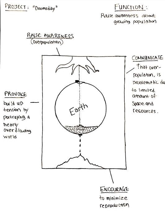
Function
We called the project Doomsday, with the idea that we’re building up to the limits of the earth (in terms of resources and space). Our main function was to raise awareness about our population growth and communicate or provoke people to think about the problems that come with overpopulation. We decided that the physicalization was to encourage people to minimize reproduction, but had not really thought this through.
Behaviour
The globe would fill up with sand based on live data of birth rates and leak based on current death rates. The population will thus be portrayed according to the content of the globe. In hindsight, we forgot to think about two really important things:
1) With how much sand are we going to portray the current population?
2) How will we ever know when the globe is going to reach its limit?
The input source is portrayed as a tree, which stands for the tree of life. I don’t really know why we wanted to portray this, as it doesn’t really clarify ‘birth’ to me.
Structure
After a small discussion we decided that the physicalization was meant for the capitals of the world and would be placed at a central point (the station), to reach as many people as possible. The transparent sphere had to be resistant to weather conditions and rough bystanders. The nozzle would shoot sand into the Plexiglas made globe and the leaking process would be regulated by a lid. To make this work, we could use Arduino to monitor the live data and make adjustments. The sand in the bottom would have been portrayed in a dark color, to clarify the difference between life and death. The sand would be collected in a reservoir and pumped around, back to the sand container. The entire installation would be placed in a glass box for safety reasons.


Important notes from the sketching phase
- Always think about what you want to achieve with your installation, especially if you encourage people to do something.
- How do we physicalize data that we cannot determine in advance? We don’t know when the earth is going to reach a limit, so how do we know when the globe should start overflowing?
Seminar (27th of November)
I found it difficult to pinpoint benefits of data physicalization from the articles. During the seminar, at least a few benefits of data physicalization emerged from the 2015 article:
- It leverages our perceptual exploration skill, which is relevant to our project
- It makes data accessible to people with impairment
- There are cognitive benefits
- Helps to communicate and engage with people
Al thought I was at first not convinced that data physicalizations contributed in engagement, a discussion that arose during the seminar changed my opinion. Having tools to engage in a conversation is most certainly benefit, because it helps one to underline his words by the simplest object.
For example: I thought back to an evening in the pub, where I tried to explain something to someone using beer mats. Whether it is a calculation or topography, the beer mats contribute to my explanation and representation.
One of the questions that came forth during the seminar was: “ Are 3D representations more accurate than 2D digital representations? Can we perceive them with less effort? “ After a discussion about the question, I concluded that this depends on how we define accuracy. In terms of depth perception, for example, we can make a more accurate representation of an object if we have the real time size in our hands rather than looking at an image of the same object. Having a real time representation makes it possible to perceive the actual size of that object with less effort and more accuracy.
The visualization criticism in the 2007 article was negatively received by more people in the classroom due to the critique being common sense. The author is proposing criteria to think about and to standardize visualization of data with. If we compare it to modern society, he did not manage to convince people to use them. The class felt like the author has little understanding of art and is more in touch with data, which makes it weird that he’s proposing visualization criteria.
List of notes from the seminar
- Data physicalizations leverage our perceptual exploration skill
- Data physicalizations are, in contrast with what I thought before the seminar, a good tool to engage and communicate with. I unconsciously use objects to enhance my words regularly.
Prototyping & presentation preparation (28th of November)
Although it was a complex installation, we still tried to make a small scale prototype to give a demo of our idea during the presentation. We used the laser cutter to make it with, because I still think this is a very fast way to make simple prototypes. I lasered three circles: a full one, one with just the outer frame and one that was split in two. By gluing these together we were able to fill the circle. We put some transparent film in between to seal it off and had an image of the globe on the back to portray the earth with. We also cut out a tree to hide the bottle of bath salt with, which we used to fill the globe.

We found it difficult to shape the presentation. Personally, not only because there were preconditions for the design, but also because it was a rather complicated week in which we had to think more and, in my opinion, put less on paper than in previous weeks. I was also a bit more critical of the articles and the seminar gave me only few new insights. This does not mean that I did not like the subject! In the end we were able to make the presentation using the FBS ontology.
Presentation (29th of November)
The first reactions after our presentation were initially quite positive and gave us some insights about our own prototype. Maliheh, for example, thought that through our symbols, we had made the informative part of the concept pretty clear. She also thought that the leaking sand that portrayed the death rates was quite provoking. However, I still find it more provoking that the globe is filling-up until it reaches a certain limit. It was clear that our concept was provoking because, after the first few reactions, a fierce discussion started.
Classmates wondered if we had thought about the cause of overpopulation. They thought that we adopted a fairly western political stance. They said it is not necessarily the amount of people being born, but rather the behavior and consumption of the people in the western world. Our installation tends to put the blame on countries in Asia and Africa, for putting to many people on the world. According to some people in our class, we should encourage people in the west to change their living standards. People have children for a reason (i.e. to take care of their parents when they grow old).
The discussion was fairly surprising, as I had not thought that our concept would be this provoking. Even though provoking was one of the goals of this week’s topic, I think we could have done more research on the reasons behind overpopulation and we could have thought of a better way to engage with the audience.
Key-note from the presentation feedback:
- I think we have to do more research in the topics that we choose, especially if we’re designing for data physicalizations / visualizations. It is best to understand the information that you visualize or physicalize and to understand how you are trying to provoke people.
Literature
Ishii, H., & Ullmer, B. (1997). Tangible bits. Proceedings of the SIGCHI conference on Human factors in computing systems – CHI ’97. https://doi.org/10.1145/258549.258715
Jansen, Y., Dragicevic, P., Isenberg, P., Alexander, J., Karnik, A., Kildal, J., … Hornbæk, K. (2015). Opportunities and Challenges for Data Physicalization. Proceedings of the 33rd Annual ACM Conference on Human Factors in Computing Systems – CHI ’15. https://doi.org/10.1145/2702123.2702180
Kosara, R. (2007). Visualization Criticism – The Missing Link Between Information Visualization and Art. 2007 11th International Conference Information Visualization (IV ’07). https://doi.org/10.1109/iv.2007.130
