Tangible and Embodied Interaction (2019) – Week 1
I have the feeling that this course was going to be more in line with what I had expected as an exchange student. Group projects that include: doing research, making prototypes and usability testing are more in line with the assignments that we do at our academy in Maastricht, the Netherlands.
I have never been a big fan of reading, certainly not reading academic papers (which I am trying to improve). However, I noticed that I was able to get through the literature more easily because of the experience I gained in the previous course. In addition, I have learned that the provided frameworks in the literature can sometimes be helpful to get started with design practices.
About the topic – Glanceability (11th of November)
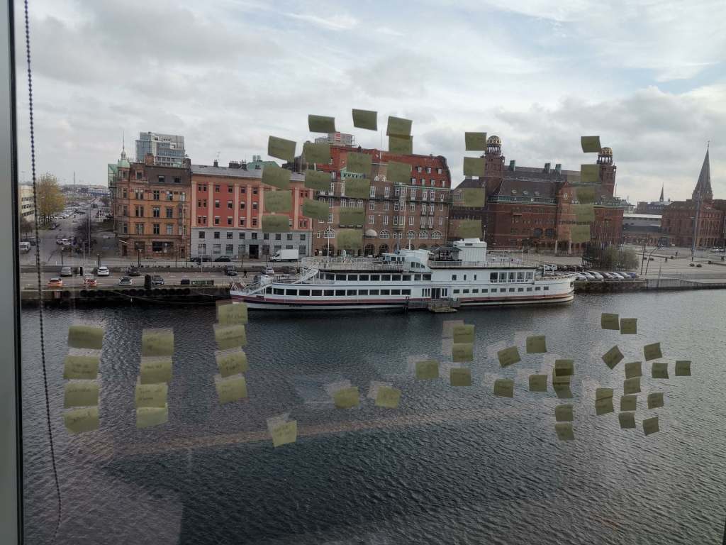
During the first lecture we did a group exercise in which we had to write our daily activities on post-its. After we clustered these, the intention was to choose the five most important daily activities. This has to do with prioritizing activities / implications, which will be an important design component throughout this course. The exercise felt like rapidly mapping out a user journey and then decide on the most important design implications (i.e. diverging & converging).
After the lectures and reading the articles, I interpreted glances as: short (5-second) and low-cognitive moments of feedback where individuals check ongoing activities with no further interaction. According to the articles, they support our ways of multitasking, self-monitoring and have the ability to change our behavior. One way of designing glanceable feedback is through peripheral displays, a display that is outside of one’s focal vision (i.e. primarily task). Other ways of designing glanceable feedback could be through, for example, smell or sound.
The articles discuss guidelines, qualities and criteria that help us designing glanceable feedback. I think some of the provided guidelines (i.e. criteria, qualities) will come in handy during our design practice, but since most of the articles are pretty old I am not sure how relevant they can be in current times.
I can relate to some examples given in the article based on personal experience. For example, I notice the step counter on my phone nearly every time I am using it and it regularly stimulates me to walk another block around to reach my daily goal of 10.000 steps.
Article 1 – Designing and Evaluating Glanceable Peripheral Displays (Matthews, T., 2006)
Even though the article is rather old, I still think it can be relevant for understanding the topic of glanceability and its characteristics. They explain few terms in the article, making it difficult to understand exactly what they used for their analysis. It gave me the impression that symbolism and dimensionality are the main abstractions for designing a pheripical display. The overall article was more like a discussion of creating terminology for designing glanceable peripheral displays.
Article 2 – Exploring the Design Space of Glanceable Feedback for Physical Activity Trackers (Gouveia, R., Pereira, F., Karapanos, E., Munson, S. A., & Hassenzahl, M., 2016).
The article is not as old as the first article and I see this as the most relevant article for ways of doing research into glanceable feedback, because research methods used associate with modern tools (e.g. Reddit, smartwatches). I do question the quality of the research, because the participants were gathered through a social network and were rewarded for their effort. I find the design qualities in the article a good source of inspiration to get start with our design practice.
For example, while reading, I had little expectation of the example of Gardy, which in retrospect also offered few positive results. Afterwards I started thinking about ways to improve this application in current times, through for example personalization or gamification.
In addition, the competitive glance-related concepts offered an expected outcome, because the outcome was recognizable from one of my first-year projects in which I had made an exercise app with competitive notifications. Participants told me that falling behind of other users worked very demotivating while getting far ahead of others made participants lazy. These are good insights to keep in mind during our design practice.
Article 3 – Evaluating Peripheral Displays (Matthews, T., Hsieh, G., & Mankoff, J. , 2009).
The article is relatively old aswell, but the use of criteria (i.e. heuristics) can be valuable for us. Using Heuristics for usability testing is a very common topic within our own academy, since it is very user-centered. We have used cognitive approaches within our own design process and we have been using Nielsen’s Heuristics to test our own prototypes throughout our education.
Overall, I think the articles gave some good insights into the topic and I can see the relevance of having criteria, guidelines or qualities to define our own glanceable feedback system. During the lecture, David mentioned that Google has guidelines for designing smart-devices and glanceability. These guidelines will also come in handy while exploring and designing.
List of most important notes from the lecture and articles:
- It is going to be important throughout our design practice to choose design implications with the most priority.
- Glances are short (5-second) and low-cognitive moments of feedback where individuals check ongoing activities.
- There are guidelines in the articles and on Google, which we could take into consideration while designing glanceable feedback.
Seminar – Discussing the articles (12th of November)
We prepared for the seminar by answering the questions given in the document in a pretty straightforward way. It was the first time I ever attended a seminar, so I had no idea what to expect. During the seminar I learned that we have to go in more depth about the questions in relation to the article and form an opinion about the article. We have to discuss the relevance of the article in relation to our own design practice and modern society.
The questions about the authors and publications seemed rather easy and unimportant at first, but during the seminar I understood that looking into the author and publication to see if the article is worth reading.
For example, we need to look into the authors (e.g. how much they have published, how often they have been quoted etcetera) to distinguish if the article would be of any quality. We should also look at the type of analysis that’s been done about the subject and form a proper discussion if the articles are going to be relevant.
According to David, this will be valuable during the second part of the course, because we will be doing research ourselves.
In addition, it’s good to research terminology to make sure we properly understand the topic. Writing about a subject without properly understanding the terminology you’re using can become problematic and it might confuse the reader.
For example, during the seminar I realized that I misinterpreted feedback. I interpreted it as an expression of a process. According to David, it is a constant feedback loop that can influence or change behavior. It is used as a sort of control management system.
To conclude this paragraph, throughout the seminar I realized that it can be important to question and compare articles to modern society / times and think about important factors to keep in mind for designing (glanceable feedback). For example, if we compare the second article to available resources that we have right now, we can think about personalization and randomness as two important factors to be researched. Overall, the seminar gave me a different way of looking at a paper (i.e. checking the authors, using it as a source of inspiration, building on ideas while reading, use it a tool to discuss and form an opinion about its relevance to modern society).
List of most important learning outcomes from the seminar:
- Check the authors and publications to determine if the article could be of use (i.e. good quality).
- Research & understand terminology in relation to our design practice
- Compare & reflect on the relevance of the article to modern society
Group work – Ideation & Prototyping (13th of November)
As a brainstorm method, each of us wrote down as many scenarios as we could come up with within 10 minutes. The best scenarios for each member were then written on a post-it and grouped together on a paper. Each group member received three votes for the scenarios on the paper. The best voted scenario was designing glanceable feedback for a chef, to support his ways of multitasking while cooking a specific recipe.
I thought it was a fairly efficient way of brainstorming, because everyone was in line with the final chosen scenario. This scenario was chosen because a chef often works on several dishes at the same time, while also managing the rest of the kitchen. I can tell from experience that it is often a hectic environment that provides multiple opportunities for designing glanceable feedback.

We chose to work with a tablet and a smart watch as our devices, because a tablet is a commonly used device within a restaurant and a smartwatch is easily glanced at. Having a smartwatch also prevents the chef from taking his phone out of his pocket or having to look around the kitchen. We also thought about the use of, for example, smart glasses, but concluded that they are not really beneficial in a kitchen environment because of condensation and such.
We started mapping out a user-journey to discover how we could help a chef when preparing a certain recipe, but we couldn’t figure out how to design the interfaces without too many interactions and interrupting notifications. Giving glanceable feedback in the form of instructions from a recipe book was not really a beneficial way to go, as we thought it would be rather annoying to receive lots of notifications. How would the interactive system even know when a previous task had been completed? Wouldn’t it just become confusing if a chef’s cooking multiple recipes at the same time? I really felt like we took a wrong approach to our scenario.
After we discussed these complications, we concluded that we were to support a chef’s way of multitasking, not providing him with instructions & additional tasks. I figured a chef doesn’t need guidance with preparing receipts as he can probably dream them. Thus, we changed our approach to supporting the management of incoming & outgoing orders.
We sketched out the journey along with small UIs for both the tablet and the watch and then we went on to discuss the user journey and design choices. The first thing we figured is that the watch is going to be used by all the kitchen personnel. We spend quite some time on questioning our own ideas and discussing possible implementations.
For example, the amount of notifications that a chef would receive about incoming or expected orders was a topic we stuck with for a while. We thought it would become very annoying to get non-stop notifications. This would not improve multitasking and communication, but actually make situations even more hectic. But then the question was, when is the chef going to be notified and about what?
Once the user journey was sort of mapped out (It did not really feel like a complete journey to me, but we went with the flow), we arrived at the discussion about how the interfaces were going to look like. We quickly agreed on the display of the tablet, but for the smartwatch it was quite a challenge. I think this is because we are not used to designing for a smartwatch. To get a feeling for designing for watches, we used the Google Guidelines (https://designguidelines.withgoogle.com/wearos/ ).

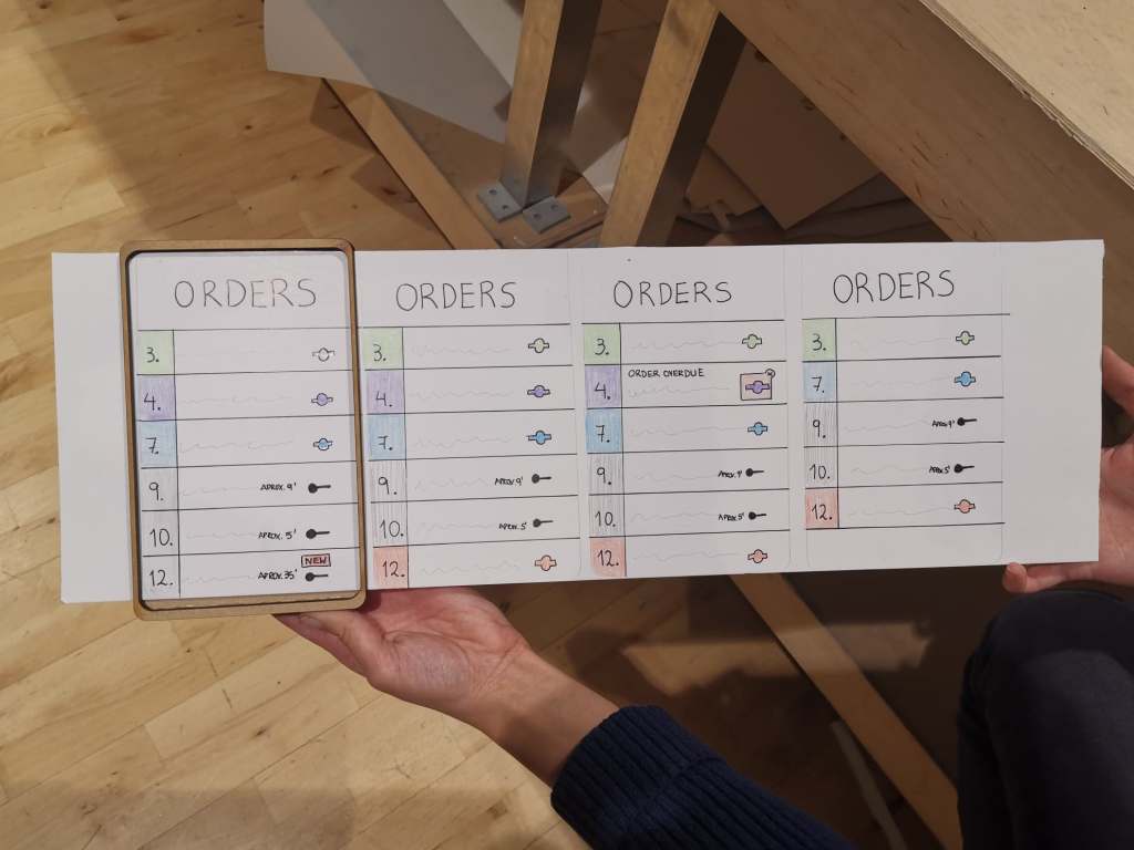
The display of the notifications were fairly obvious, so I don’t feel like spending words on that. What I found more interesting was the display (i.e. overview) of the orders on the main screen, so that they were easy to glance at.
First, we positioned the progression bars on the outer circle of the watch, because this was also done with progression bars in examples of the google guidelines and it offered us a logical solution.
Second, we decided that each order would get it’s own color, to make it easy to distinguish priorities. To make even easier to glance at, we decided to apply color shadings. As a result, the orders with the most priority stood out much better.
Lastly, we decided to display the order number in the progress bar so that it was more clear which order it was. However, this turned out not to be a good idea, because the numbers were hard to see. This worked better when we displayed them on the outside of the progress bar, but this was confusing in combination with the analog clock. That is why we finally decided to make the clock digital, which eliminated the confusion.

As Nefeli continued sketching out the interfaces for the watch and the tablet, Michael and I started working on the physical prototype. Throughout the prototyping phase, we checked up on each other to discuss possible ways to create the physical prototype and make a few changes to the sketches. We decided to use the laser cutter, because it was one of the fastest ways to create a solid and representative prototype (MDF material). I sketched out the prototypes in Illustrator and made a few prototypes to check the measurement and get a feeling of how the device would be looking in reality. We also thought about possible ways to slide the paper interfaces through.
I barely use the laser-cutting machine back at our academy in Maastricht, but I now learned that it might be one of my favorite ways to rapidly create a prototype that is both solid and practical. The prototyping phase resulted in a number of minor changes with regard to priority for design choices. As far as I was concerned, this ensured a pleasant cooperation in which everyone had the same goal in mind.
Important notes from the prototyping phase:
- Find a small part of a complete user journey to work with.
- Apply color shadings to more easily distinguish priorities.
- Digital time in combination with tiny numbers works better than an analog representation while designing for watches.
- Laser-cutting might be my new favorite tool to rapidly create physical prototypes with.
Video prototyping & presentation preparation (14th of November)
Overnight, we discovered that wearing watches in the kitchen is not allowed in most restaurants due to hygienic reasons, thus our concept would not be approved in most cases. We questioned ourselves, in which situation would it actually be really important? We concluded that the tool might be a very important implementation for a chef with hearing impairment. This made me realize that it is necessary to do a little bit of research into the context we’re designing for.
Fortunately this little twist changed nothing to our concept. However, we now had to consider that the chef in the video was hearing impaired or even deaf. In addition to the fact that we did not have a professional kitchen available, shooting the video was generally quite difficult. We hadn’t thought about ways to hide the sliding paper tablet interface and we had to shoot from various angles to actually make the kitchen look somewhat professional. There was also no room to make it look like there were many people working in the kitchen, so we had to improvise most of our thoughts with sound.
To clarify the concept of the hearing-impaired cook, we had cut-away the busy kitchen sound when we changed to 1st person perspective. By means of the sound of vibrations, we indicated that a notification had been received. These parts were pretty self-explanatory.
For me, however, the most challenging part of making the video was explaining the communication between the watch and the tablet (i.e. the concept). We eventually explained this by adding text, but I would have preferred that we had clarified this within the video itself.
I think it would have been better to use digital tools to prototype the interfaces with, because it would have given us more room to explain the ongoing interaction. For example, we could have shown two screens simultaneously, to which something changed on the watch after interacting with the tablet.
Nonetheless, I think we made a pretty solid video to present our idea with.
For the presentation we had used a template that I had made the previous year. I fulfilled my role by helping with both editing the video and making the presentation. We were well aligned as a group, so the content of the presentation was rather quickly filled.
Important notes from the video prototyping phase:
- Do research into the context before starting with a design.
- Consider using digital tools to prototype interfaces when video is made in context or prepare a better paper prototype to hide additional screens.
Presentations & Critique (15th of November)
During some of the presentations of our peers, I really felt like we came a little short with our paper prototypes and video. While we might have thought a bit more about the concept, some others had spent more time in making good video and better prototypes. I do not necessarily think that one is better than the other, but finding the right balance is essential to make your concept appear convincing in the end.
In addition, I noticed that a clear definition of the concept along with a proper explanation of the context is the key to presenting an idea. This opens a discussion about the idea itself, and not the circumstances surrounding it.
In terms of our own presentation, we should have explained the additional value of our system, because people who are unfamiliar with a chef’s work quickly get confused without a clear explanation of what it is about. Although I thought we had made it clear through the sound in the video that people were working in a busy kitchen, this was not clear to David. In the future, we’ll have to clarify the situation in which our video takes place.
One of our classmates asked if we had thought about alternative ways to display the different orders. This reminded me to always put a small part of the design process in the presentation, which was not the case this time.
On a final note, David emphasized the importance of having interviews with “experts” about a topic, to make sure you are designing with the correct mindset.
Key insights from the presentations & critique:
- Finding the right balance of quality in concept, prototype and video presentation is essential to make a concept appear convincing.
- Having a clear definition of the concept along with a proper explanation of the context is key to presenting an idea.
- Always clarify the situation your designing for, because people might be unfamiliar with the topic.
- Remember to put a small part of the design process in the presentations, with the means of showing alternatives.
- Having interviews with experts will be extremely important in the upcoming assignments.
Reference
- Gouveia, R., Pereira, F., Karapanos, E., Munson, S. A., & Hassenzahl, M. (2016). Exploring the design space of glanceable feedback for physical activity trackers. Proceedings of the 2016 ACM International Joint Conference on Pervasive and Ubiquitous Computing – UbiComp ’16. https://doi.org/10.1145/2971648.2971754
- Matthews, T. (2006). Designing and evaluating glanceable peripheral displays. Proceedings of the 6th ACM conference on Designing Interactive systems – DIS ’06. https://doi.org/10.1145/1142405.1142457
- Matthews, T., Hsieh, G., & Mankoff, J. (2009). Evaluating Peripheral Displays. Human-Computer Interaction Series, 447–472. https://doi.org/10.1007/978-1-84882-477-5_19
